Our projects are not merely visual executions — they are structured positioning systems integrating brand architecture, market strategy, and digital performance into one scalable ecosystem.
BOOK your CONSULTATION
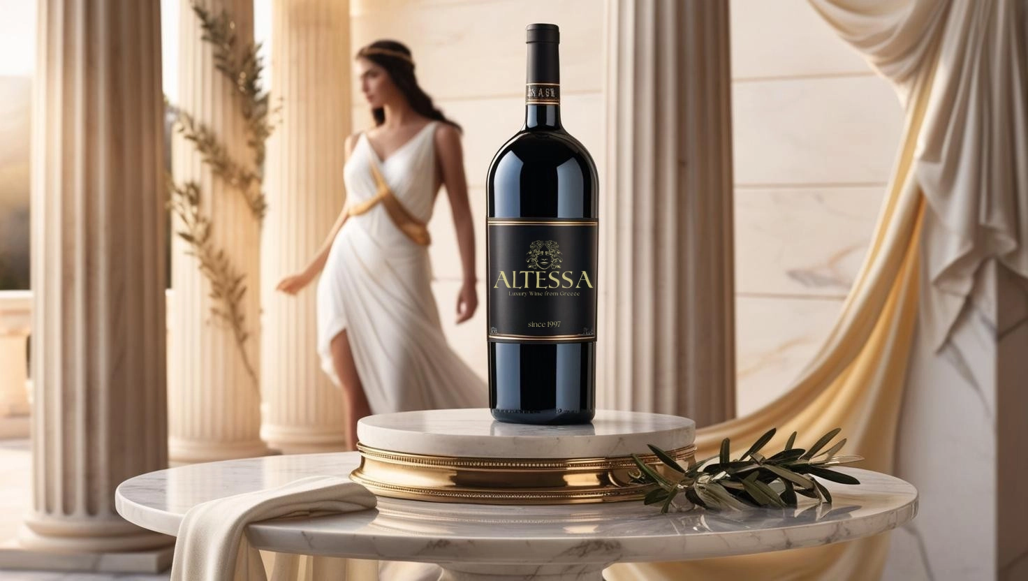
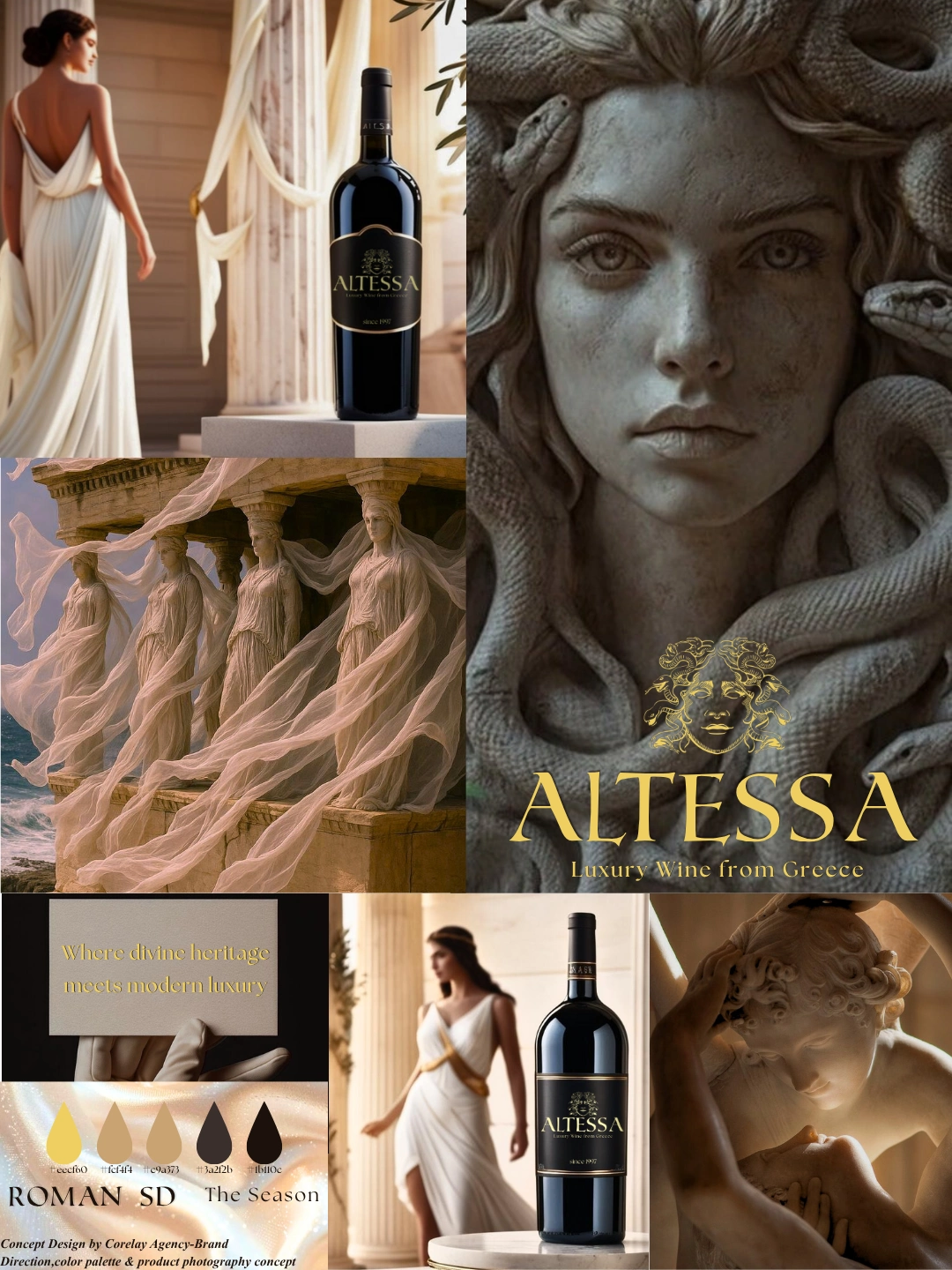
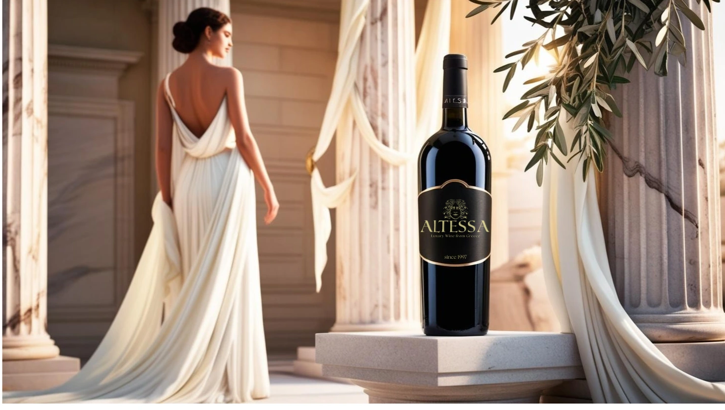
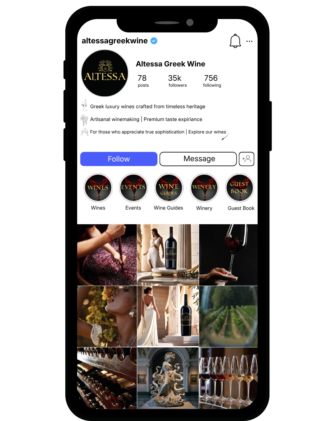
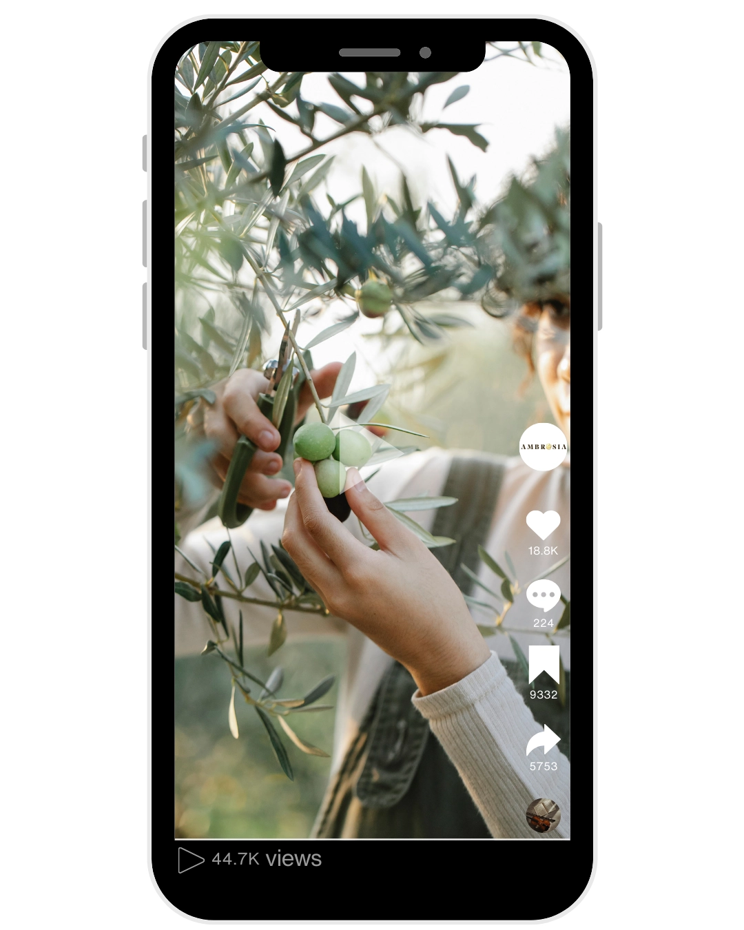
Strategic positioning of a premium wine brand through visual identity development, market differentiation, and consistent digital presence.
Altessa was positioned as a local premium wine label entering a competitive regional market dominated by heritage-driven producers and visually traditional branding systems. While the product quality met premium standards, the brand lacked structural differentiation and narrative positioning that could justify premium perception beyond packaging aesthetics. The challenge was to architect a brand system that communicates modern premium quality while respecting regional authenticity.
The initial analysis identified three structural constraints:
- Category Saturation
The wine segment relied heavily on heritage symbolism and predictable visual codes.
- Low Emotional Differentiation
Competitors competed through origin claims rather than brand identity clarity.
- Visual Overcrowding
Traditional labels created perceptual noise at point-of-sale environments.
Without strategic positioning, Altessa risked blending into established legacy producers.
Altessa was positioned as a modern premium local wine brand — blending regional credibility with contemporary refinement.
Rather than relying on traditional heritage cues, the strategy focused on:
Controlled sophistication
Visual restraint
Premium minimalism
Visual Identity System
A structured identity was developed to support this positioning:
Refined typography hierarchy
Clean, balanced composition
Elevated color palette
Label clarity optimized for shelf visibility
The design was not decorative — it functioned as a positioning tool.
Market Perception Shift
Communication evolved from generic “quality wine” messaging to a curated, premium lifestyle narrative.
Clear differentiation within local premium wine segment
Stronger shelf presence through structural minimalism
Elevated perceived value
Consistent brand narrative across touchpoints
Altessa established a premium footprint without relying on legacy symbolism.
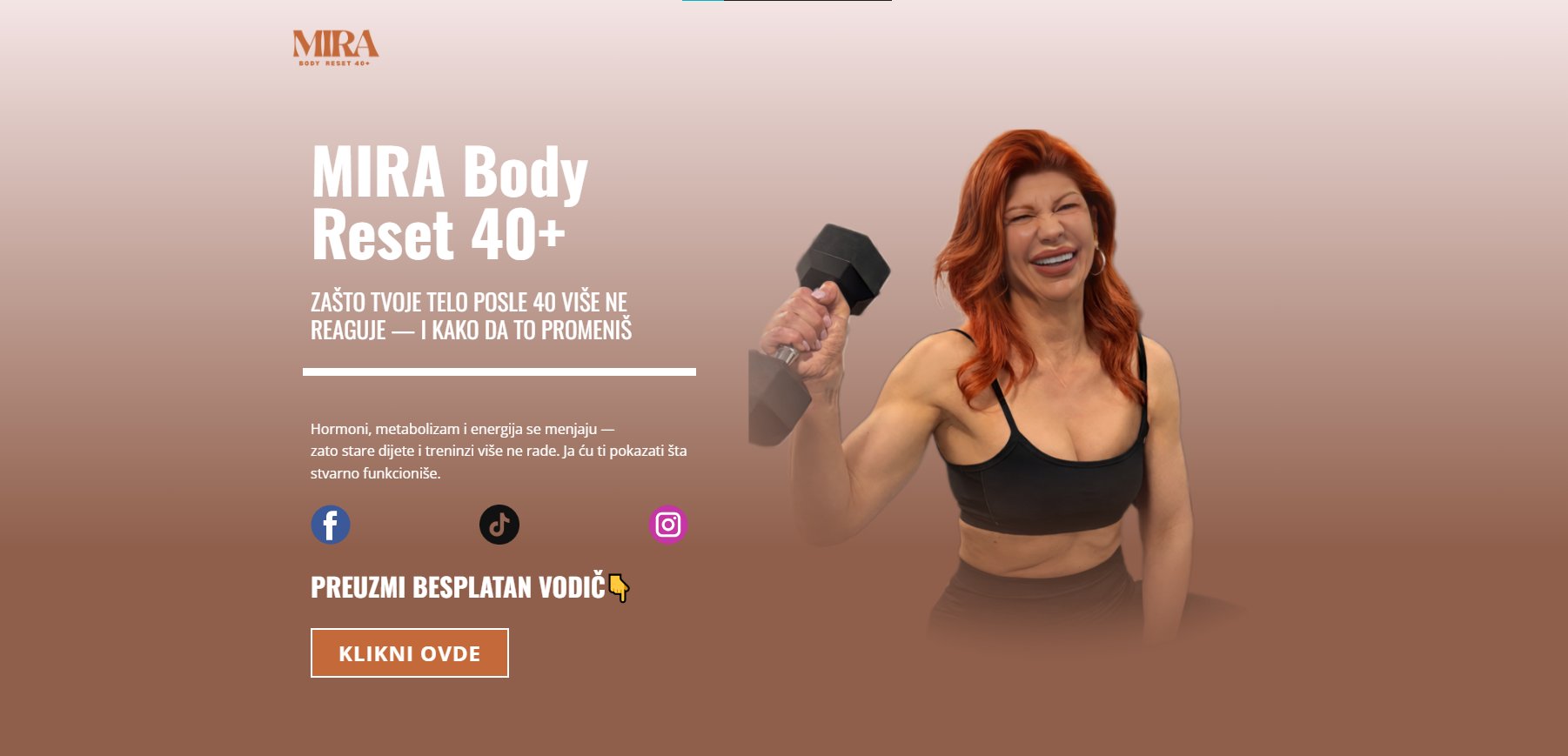
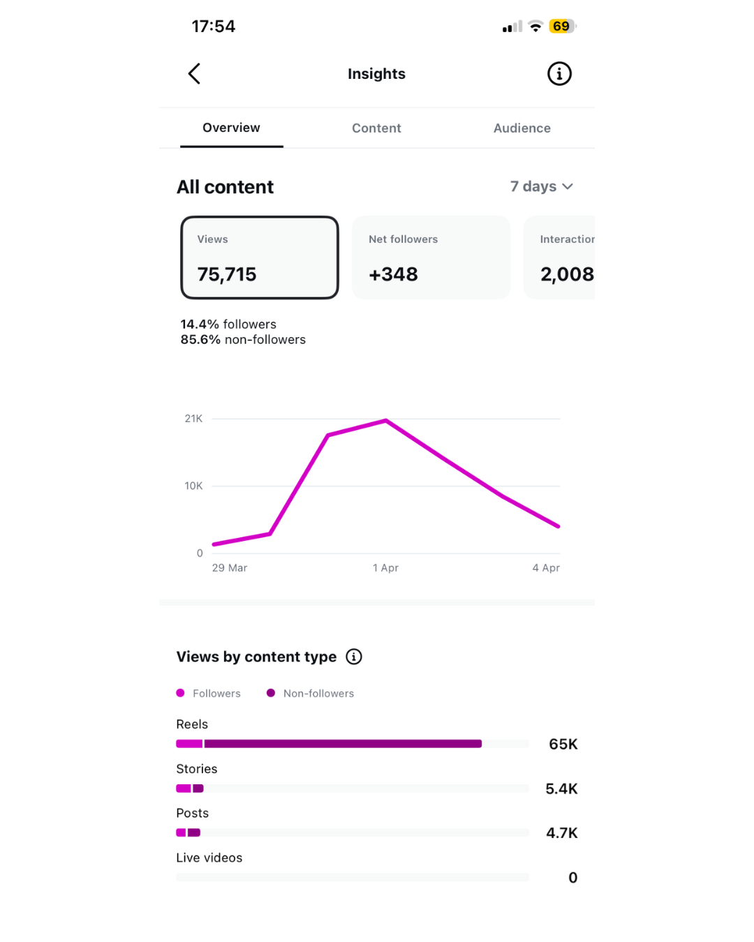
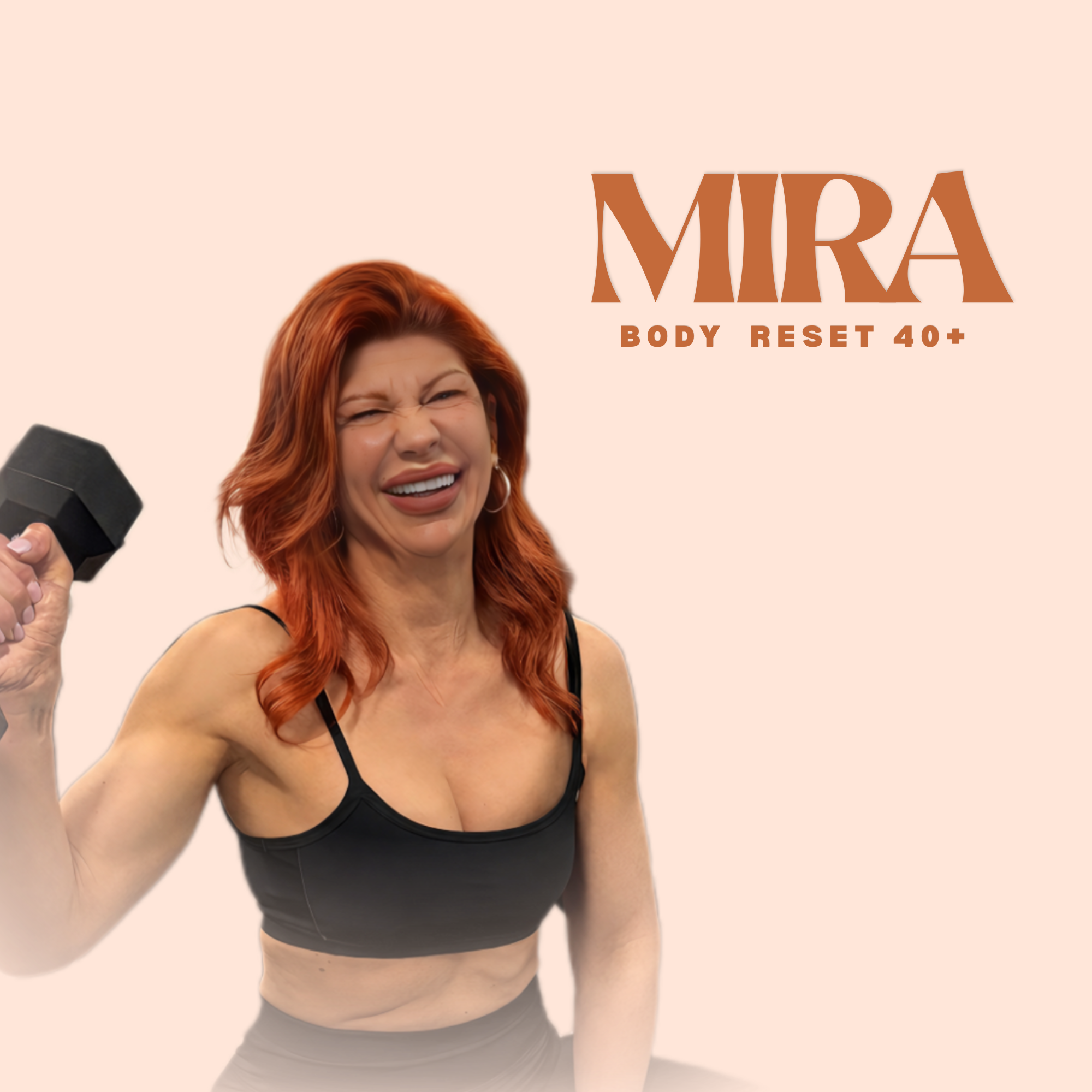
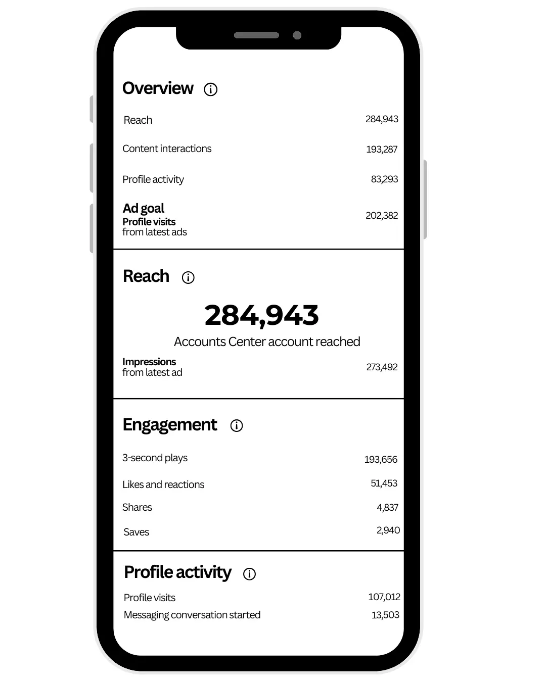
75,000 Views in 7 Days & 5 Paying Clients in 30 Days
Mira | Body Reset 40+ was developed as a specialized wellness concept targeting women over 40 navigating hormonal shifts, metabolic slowdown, and lifestyle imbalance. The brand entered a saturated digital wellness space dominated by generalized fitness messaging, aesthetic-driven influencers, and short-term transformation promises. While the program itself delivered tangible physical results, the brand lacked a clearly defined positioning, audience segmentation, and authority framework necessary to establish trust within a more mature, results-oriented demographic. The core challenge was to reposition the brand from a generic fitness offering into a specialized, expert-led transformation system tailored for women 40+, emphasizing credibility, relatability, and sustainable outcomes.
The initial analysis identified three structural constraints:
Audience Misalignment
Messaging lacked specificity, failing to directly address the physiological and emotional realities of women 40+, resulting in low resonance and weak engagement.
Authority Gap
The brand was not perceived as a specialized expert, but rather as another general fitness profile in a crowded market.
Content Saturation
The wellness niche was oversaturated with repetitive, surface-level content, making differentiation difficult without a clear narrative and positioning strategy.
Without strategic repositioning, the brand risked remaining invisible within a highly competitive and algorithm-driven environment.
A focused brand and content strategy was developed to establish category authority within the 40+ female segment.
Key actions included:
- Defining a clear target audience: women 40+ seeking sustainable body reset, hormonal balance, and realistic transformation
- Reframing messaging from generic fitness to specialized transformation system
- Positioning Mira as a trusted guide and expert, not just a coach
- Developing a content framework based on:
education (hormones, metabolism, real challenges)
relatability (real-life struggles of women 40+)
authority (structured guidance and expertise)
Aligning visual identity and tone to reflect calm authority and premium clarity, rather than aggressive fitness aesthetics
The implementation of the strategy delivered immediate and measurable results:
- 75,000+ views generated within the first 7 days of content strategy implementation
- 5 paying clients acquired within the first 30 days, as a direct result of the implemented funnel system
- Significant increase in engagement quality and audience retention
- Clear audience alignment, with women 40+ actively responding to targeted messaging
- Strengthened brand perception as a specialized authority within the niche
The brand successfully transitioned from a generic presence into a structured, profit-oriented system with clear positioning and a scalable growth model.
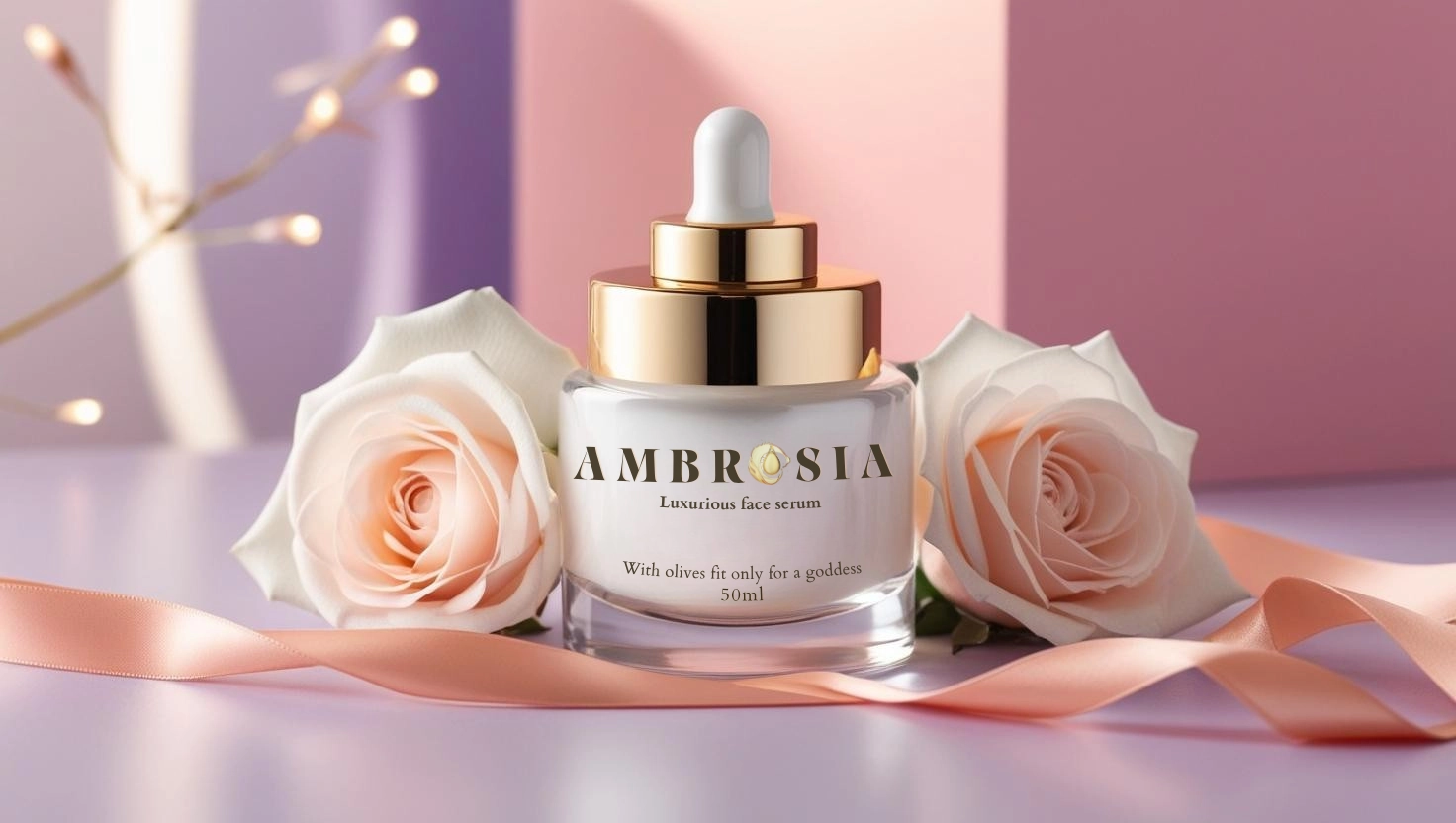
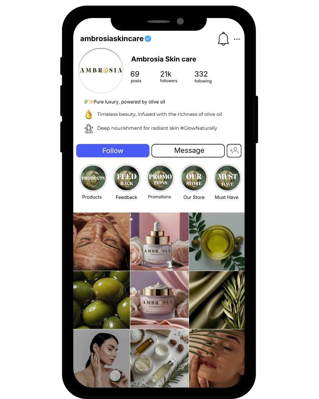
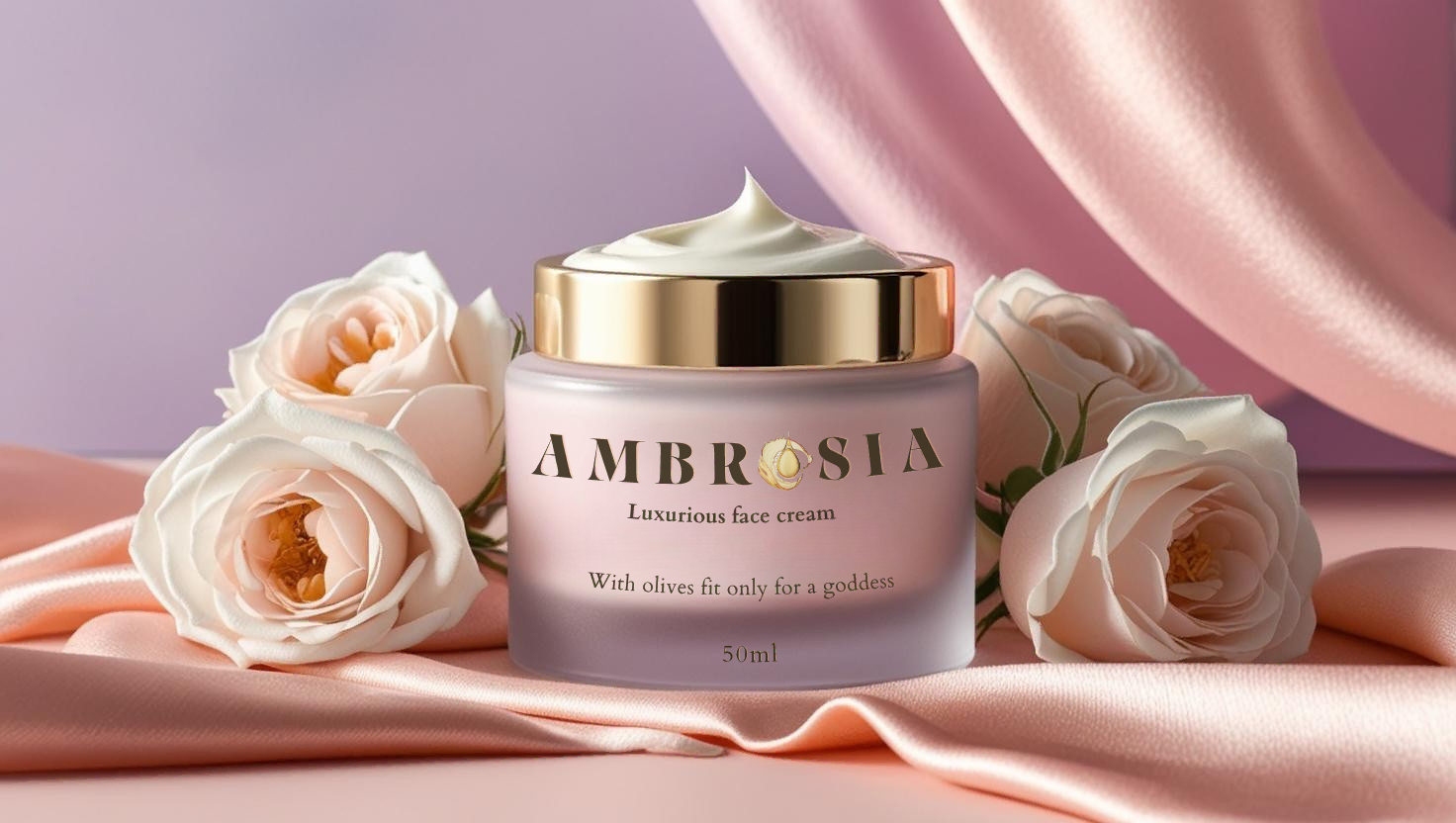
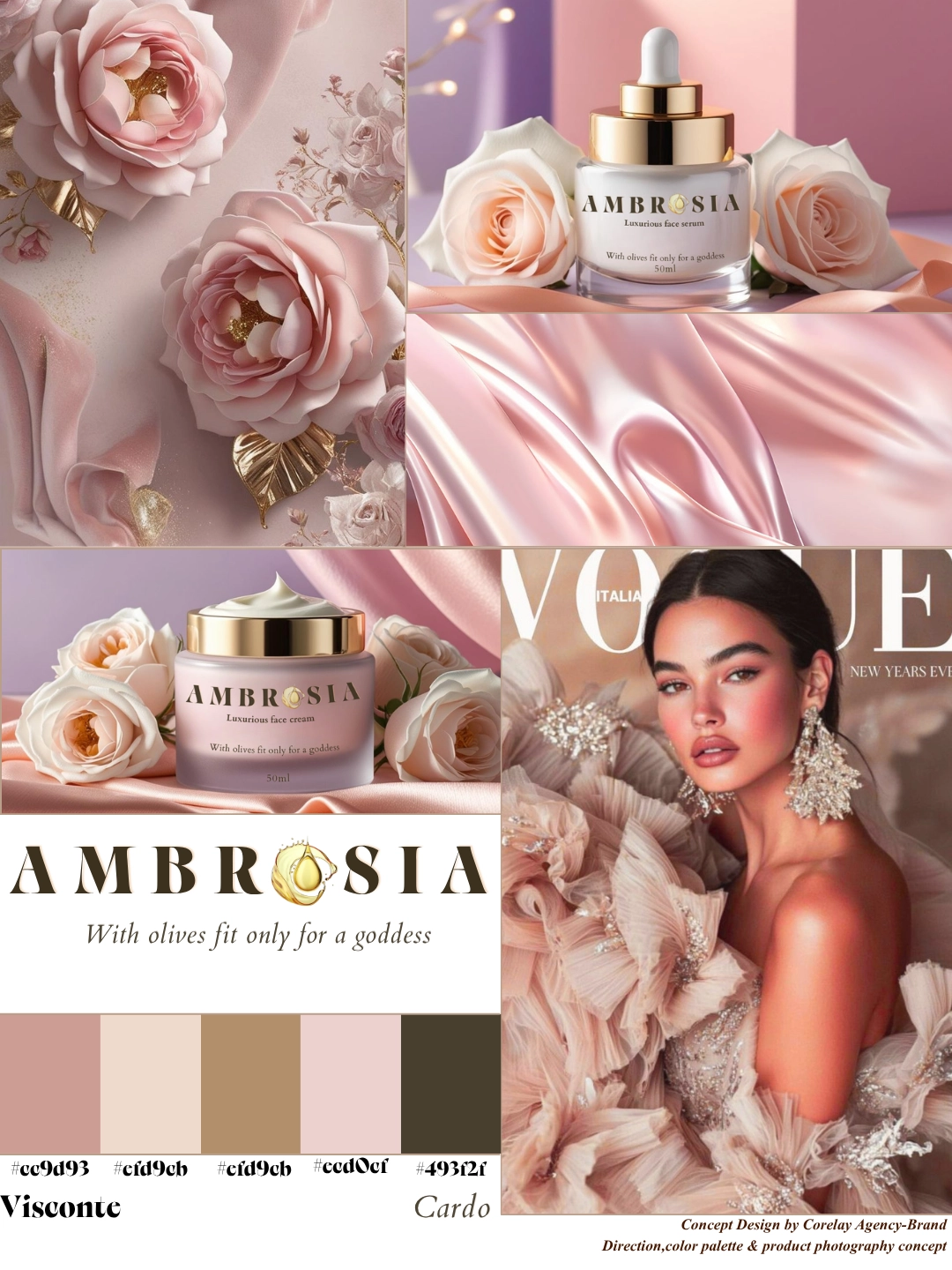
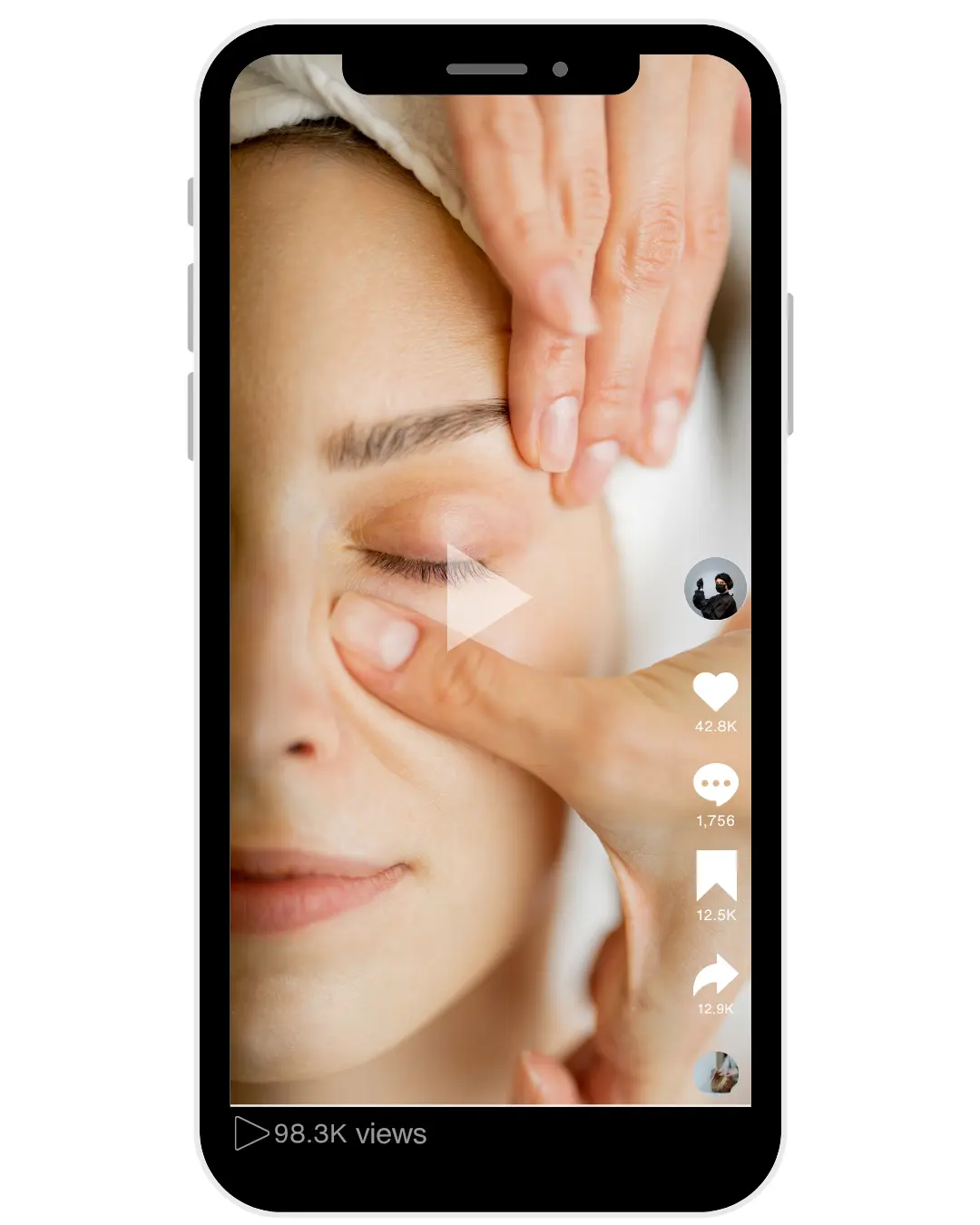
Transformation of Ambrosia into a premium skincare brand through strategic positioning, refined visual identity, clear differentiation, and a cohesive digital presence.
Ambrosia Cream entered the natural skincare market — a segment experiencing rapid growth but also increasing saturation. The category is crowded with brands claiming organic ingredients, purity, and handmade production. Most competitors rely heavily on visual softness and emotional storytelling but lack structural differentiation or pricing authority. The core challenge was not product credibility — it was strategic elevation.
Initial assessment identified three core issues:
Category Overclaiming
Nearly every competitor communicates “natural,” “organic,” and “handcrafted,” creating perceptual sameness.
Emotional Overload Without Structure
Brands in the segment focus on warmth and storytelling but fail to establish authority.
Premium Pricing Constraint
Without structured positioning, natural brands get trapped in mid-market price expectations.
Ambrosia required architectural clarity to operate as a premium botanical skincare brand.
Ambrosia Cream was positioned as a premium botanical skincare brand, balancing natural authenticity, ingredient credibility, and refined minimalism.
The brand shifted from a generic “handmade natural product” narrative toward:
ingredient transparency
formulation clarity
sophisticated aesthetics
Visual Identity
A structured visual system was developed to reflect its premium botanical character:
muted, nature-aligned color palette
minimal packaging hierarchy
clean typography
The design builds trust, a sense of purity, and a strong premium perception.
Perception Shift
Communication evolved from “natural and gentle” toward:
skin health authority
ingredient-driven formulation
conscious premium self-care approach
Ambrosia achieved clear differentiation within the premium botanical skincare segment, supported by stronger brand credibility through an ingredient-focused positioning. The refined visual system elevated perceived product value while creating a more consistent and recognizable presence across all digital touchpoints. As a result, the brand strengthened audience trust and engagement, establishing a clear and sophisticated premium identity in the market.
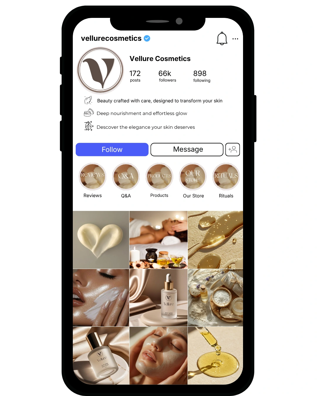
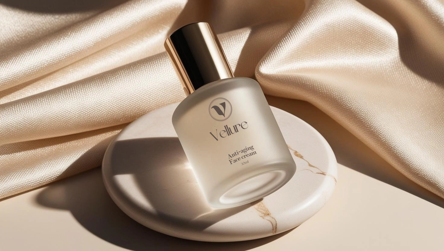
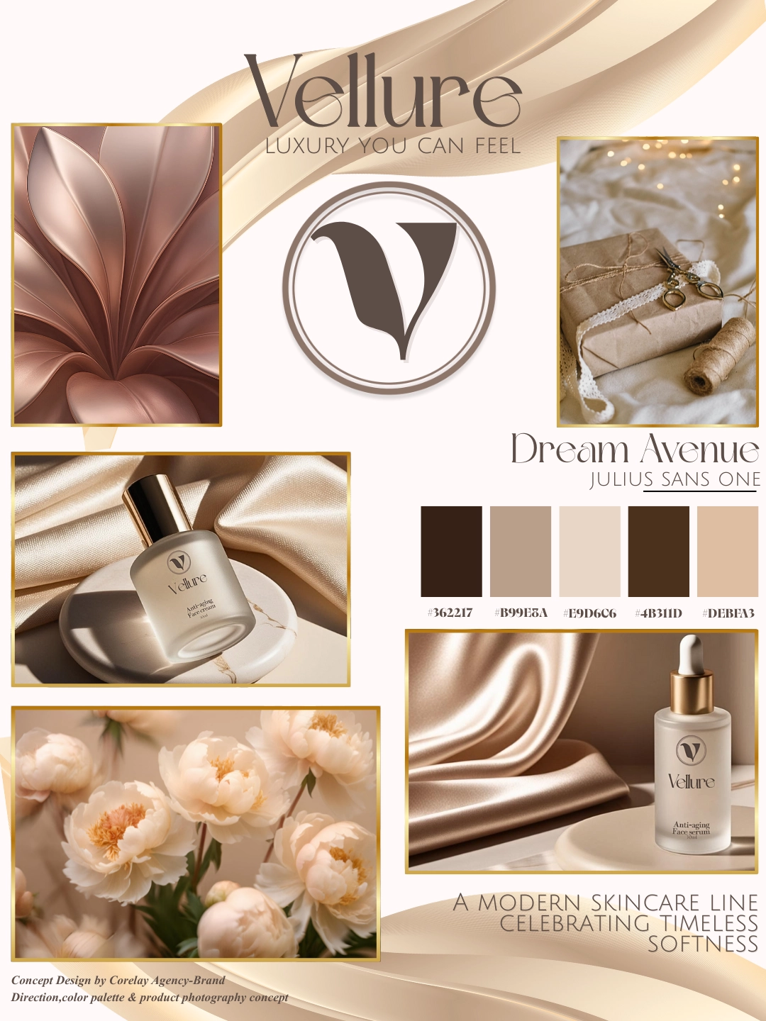
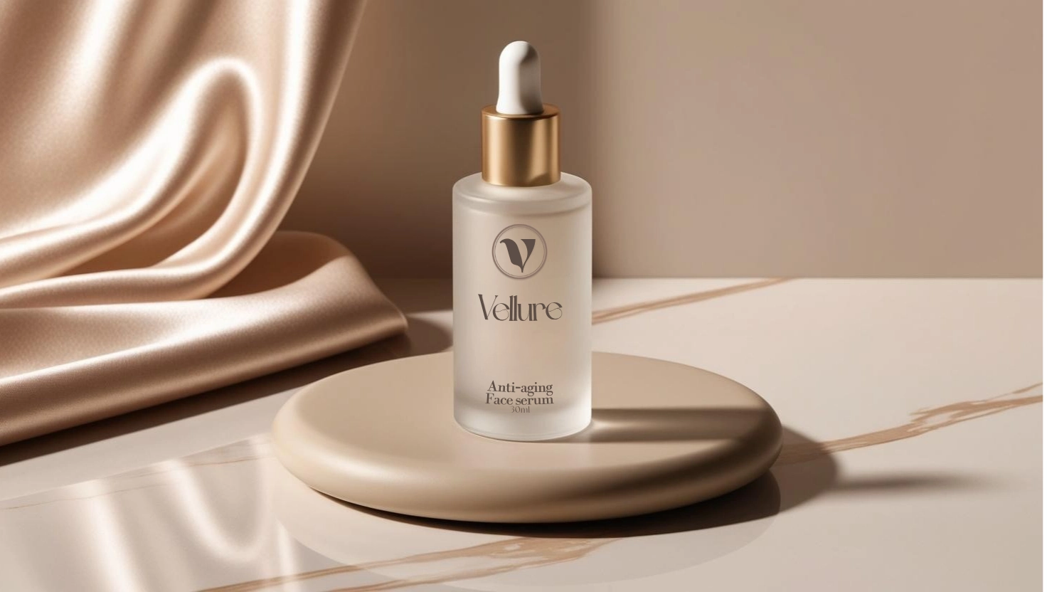
Strategic structuring of a natural premium cosmetics brand through brand architecture, differentiation, and aligned digital identity
Vellure was developed as a premium natural skincare brand positioned at the intersection of elegance, purity, and modern luxury. Entering an oversaturated beauty market dominated by clinical minimalism and mass luxury aesthetics, the brand required a distinctive, emotionally resonant positioning strategy. The objective was to build a high-end cosmetic identity that communicates refinement, sensory experience, and premium value — without losing credibility in the natural skincare segment.
Initial analysis identified three structural challenges:
- Market Saturation in the Premium Beauty Segment
The skincare market is visually crowded, with brands relying heavily on sterile minimalism or aggressive luxury symbolism.
- Undefined Premium-Natural Balance
Many “natural” brands appear either too clinical or too rustic, lacking aspirational appeal.
- Inconsistent Visual Authority Across Digital Touchpoints
A cohesive premium system was required to ensure brand recognition and high-end perception across social media and product presentation.
Premium Natural Positioning Framework
We defined Vellure as a sensorial luxury skincare brand — rooted in natural ingredients but elevated through refined aesthetics and strategic visual restraint.
Visual Identity Architecture
– Logo refinement and brand symbol system
– Sophisticated color palette (cream, muted gold, warm neutrals)
– Elegant typography pairing for luxury perception
– Packaging visual language development
Art Direction & Brand Atmosphere Development
The visual system focused on silk textures, warm light, organic forms, and curated femininity — creating a cohesive emotional brand world.
Digital Presence Structuring
– Instagram grid architecture
– Content hierarchy and visual storytelling system
– Conversion-aligned visual consistency
– Profile authority optimization
• Clear differentiation within the premium natural skincare segment
• Elevated perceived product value
• Strong emotional identity aligned with luxury expectations
• Cohesive cross-platform brand presence
• Scalable visual system suitable for product line expansion Vellure transitioned from a cosmetic concept into a structured premium brand ecosystem.
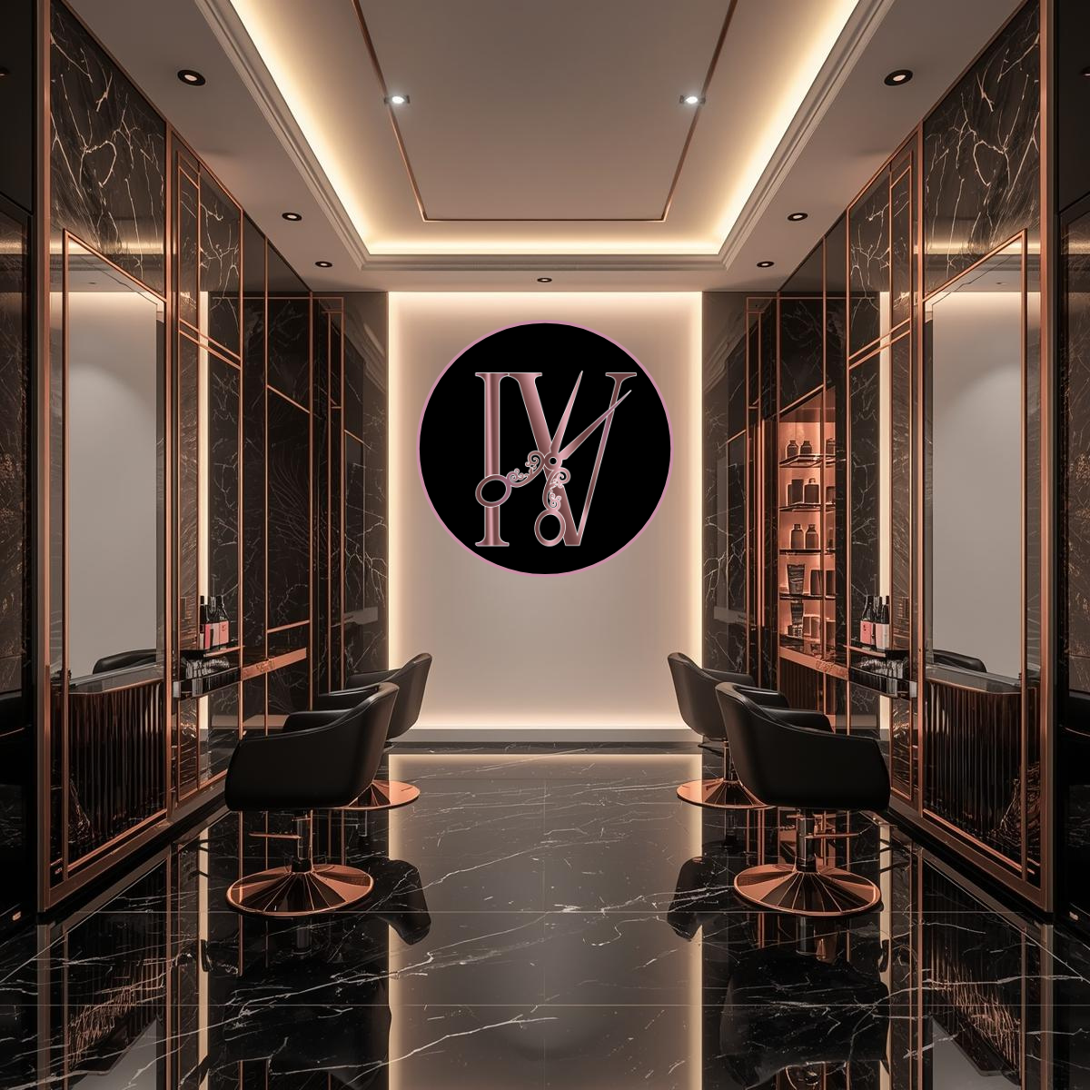
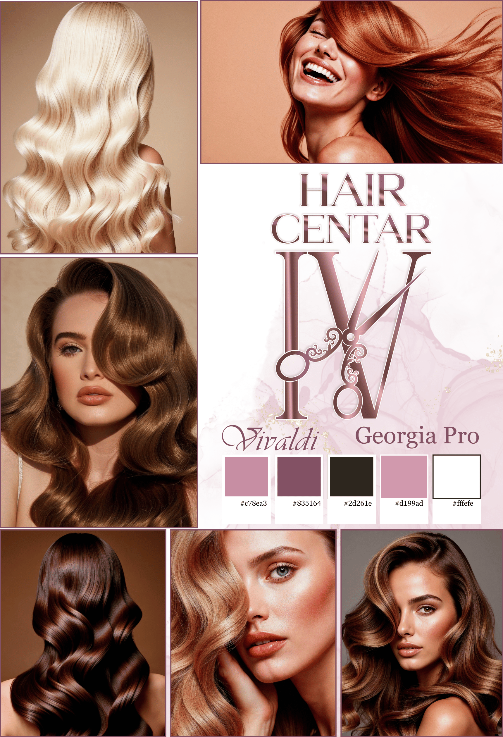
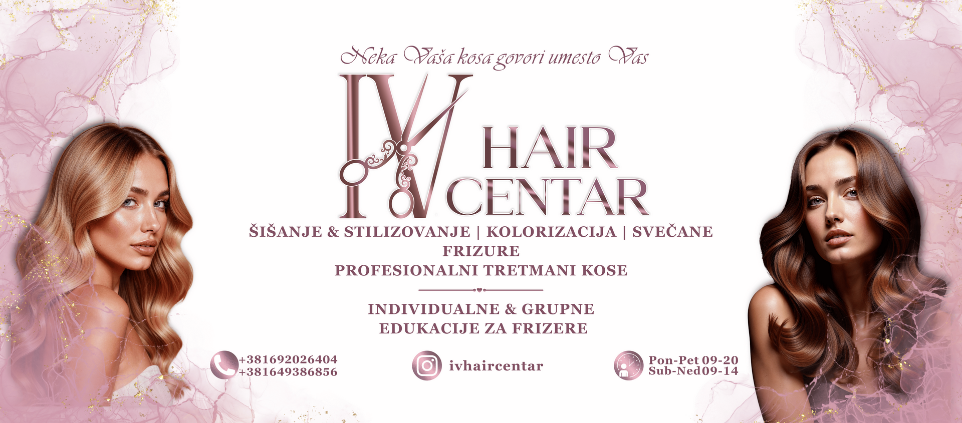
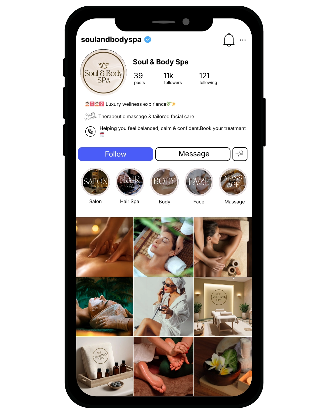
Full transformation of a local salon into a premium beauty brand through market analysis, positioning refinement, and visual system development
IV Hair Centar operated in a highly saturated local beauty market characterized by price-driven competition and low differentiation.
Most competitors relied on trends, discounting, and volume-based positioning. Although the salon delivered high-quality services, its brand perception remained aligned with mid-market competitors. The core issue was not service capability.
It was structural positioning.
A structured assessment identified three key gaps:
- Perception Gap
Service quality exceeded brand perception.
- Authority Deficit
No clear differentiation from standard local salons.
- Value Compression
Premium services were being evaluated through a mid-tier pricing lens.
Without strategic repositioning, growth potential would remain constrained by local competitive dynamics.
The repositioning focused on four structural shifts:
- Market Reclassification
Transition from “local service provider” to “premium beauty authority.”
- Value Architecture Refinement
Redefined service descriptions to emphasize transformation and expertise over technical execution.
- Visual Authority System
Implemented a refined visual structure aligned with premium cues:
Controlled color palette
Typographic hierarchy
Structured content layout
Consistent digital presentation
- Communication Realignment Eliminated discount-driven messaging.
Shifted narrative toward confidence, transformation, and controlled exclusivity.
Clear premium positioning within the local competitive landscape
Elevated perceived value
Stronger differentiation
Structural foundation for price integrity
Improved brand-business alignment
IV Hair Centar transitioned from operational competence to strategic brand clarity.
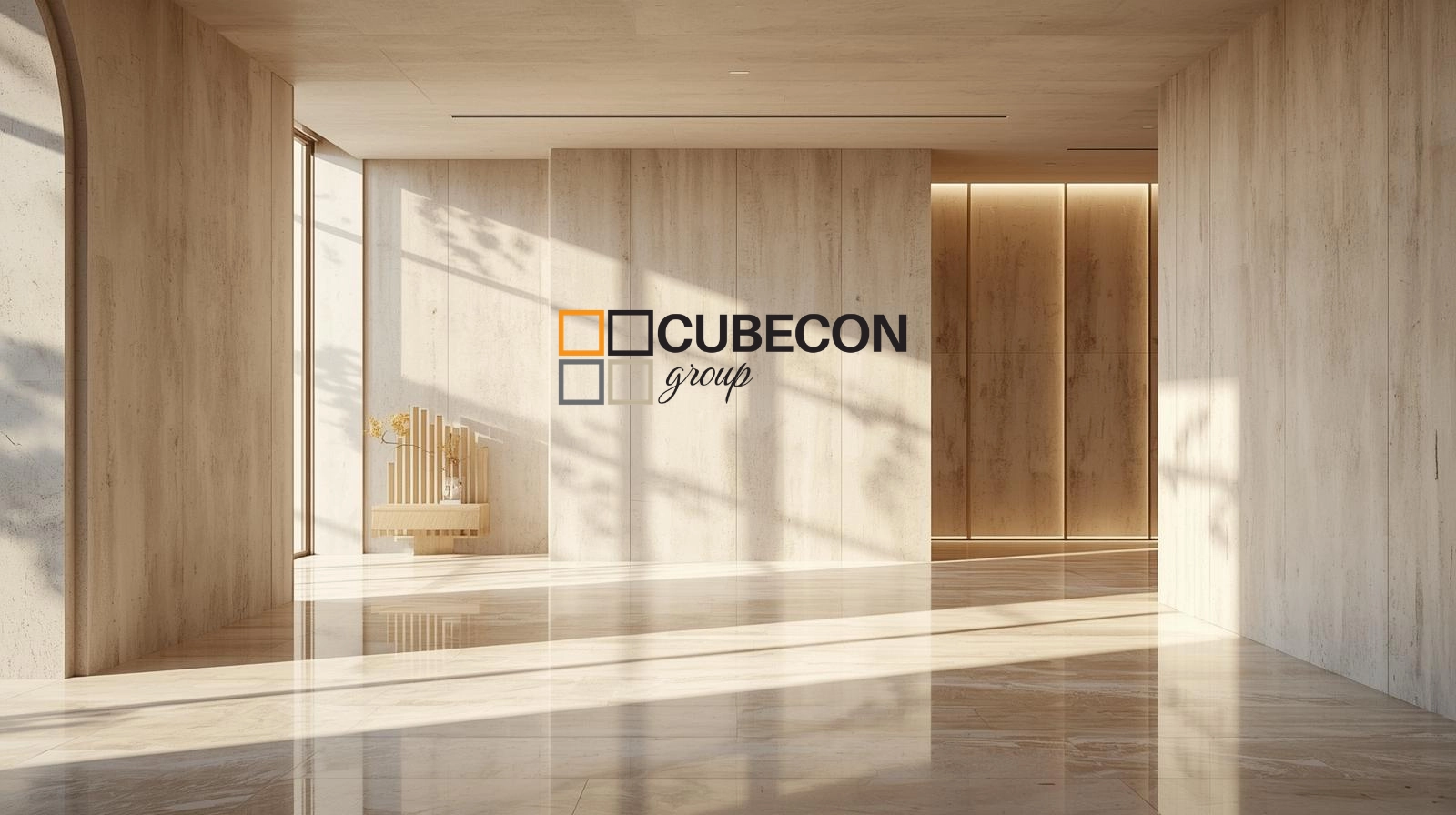
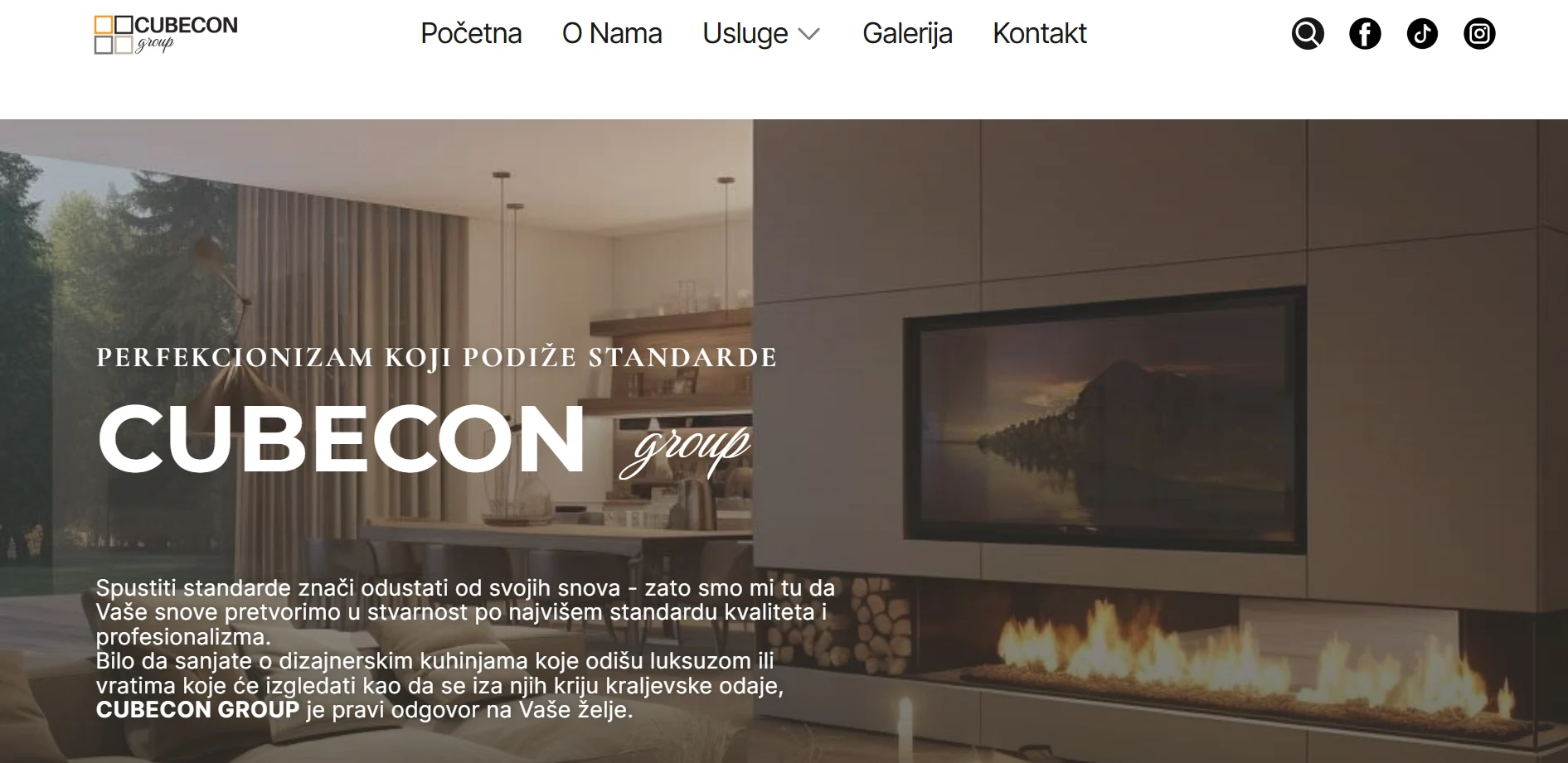
Corporate brand restructuring through clear positioning, visual identity development, and alignment of communication with market objectives
Cubecon Group operates in the premium interior adaptation and custom furniture segment — a market characterized by fragmented contractors, price-driven competition, and limited strategic differentiation. While Cubecon possessed strong execution capability, bespoke production expertise, and process discipline, the brand lacked a structured strategic narrative that would position it beyond a “contractor” perception. The objective was to reposition Cubecon as a comprehensive design-to-execution partner, not merely a service provider.
The initial analysis identified four structural positioning gaps:
- Category Commoditization
The interior adaptation market was dominated by price comparison and functional messaging.
- Low Strategic Visibility
The brand communicated services, but not structured value or process authority.
- Process Ambiguity
Potential clients could not clearly understand the step-by-step project methodology.
- Differentiation Blur
Without strong positioning, Cubecon risked blending into general renovation providers.
- Positioning Architecture
Cubecon was redefined as a premium full-cycle spatial solutions partner — integrating design, technical planning, and custom production.
- Structural Process Framing
The service model was reorganized into four clear strategic phases:
Consultation & Brief Development
Concept & Design Architecture
Technical Planning & Detailing
Production & Complete Realization
- Value Elevation Strategy
Messaging shifted from “renovation service” to:
Bespoke craftsmanship
Controlled execution
End-to-end responsibility
Precision in delivery
- Visual & Narrative Alignment
The digital presentation was structured to reinforce:
Professional authority
Clarity of workflow
Premium service standards
Trust through process transparency
The visual identity and website structure functioned as positioning tools — not decorative elements.
Clear differentiation within the premium interior adaptation segment
Elevated perception from contractor to strategic partner
Stronger client qualification through process clarity
Improved authority positioning in competitive regional market
Structured digital presence aligned with premium execution standards Cubecon transitioned from operational capability to strategically articulated value.